
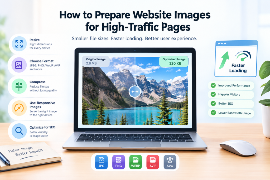
How to Prepare Website Images for High-Traffic Pages
How to Prepare Website Images for High-Traffic Pages
Optimizing images for the web is essential for websites that receive significant traffic and rely on visual content to engage visitors. Large, poorly prepared images can slow down page loading, consume bandwidth, and create a frustrating experience for users on mobile devices or slower connections. Preparing images correctly helps reduce unnecessary data transfer, maintain visual quality, and deliver a smoother browsing experience as your audience grows.
Whether you manage an online store, a content-heavy blog, a business website, or a media platform, effective image optimization starts before an image reaches your page. Choosing appropriate dimensions, selecting efficient file formats, compressing images carefully, and delivering the right image to each device can improve website performance without sacrificing the visual details that matter to your visitors.
Why Is Optimizing Images for the Web Important?
Images often account for a substantial portion of a webpage’s transferred data. On image-heavy websites, product galleries, featured images, banners, and thumbnails can collectively increase page weight and slow down rendering when they are not prepared efficiently.
Optimizing images for the web helps address these problems while supporting a better user experience.
Faster Page Loading
Large image files can delay the display of important visual content, especially when a page loads several images at once. Reducing file sizes and choosing suitable image dimensions can help browsers download and render images more efficiently.
This is particularly important for high-traffic landing pages, product categories, and articles where visitors expect content to appear quickly.
Better User Experience
Visitors may leave a page when important content takes too long to load. Efficient image delivery helps users browse galleries, read articles, and explore product listings with fewer delays.
A consistent experience across desktop computers, tablets, and mobile phones is especially important for websites serving a diverse audience.
Improved SEO and Core Web Vitals
Image optimization for SEO can support page performance and help search engines discover and understand visual content. Properly sized images, responsive delivery, and efficient loading can also contribute to better Core Web Vitals results.
However, image optimization alone does not guarantee higher rankings. Search relevance, content quality, usability, and other ranking factors remain important.
Lower Bandwidth Consumption
Smaller image files require less data to transfer. At scale, this can reduce bandwidth consumption and help control delivery costs, particularly for websites with large audiences or extensive image libraries.
How to Prepare Website Images for High-Traffic Pages
A reliable website image optimization process combines several techniques. The goal is not simply to make every image as small as possible. It is to deliver the appropriate visual quality and dimensions with the least unnecessary data.
1. Choose the Right Image Dimensions
Start by determining how large each image needs to appear on the page. Uploading a 4,000-pixel-wide photograph for a content area that displays it at 800 pixels wide can waste bandwidth when the original resolution is unnecessary.
Prepare image dimensions according to the intended display size, while accounting for high-density screens and responsive layouts.
Consider these common examples:
- Hero images: Prepare sufficiently large images for prominent banners and full-width sections.
- Blog images: Match featured images and article illustrations to the content column.
- Product images: Maintain consistent dimensions so product listings look uniform.
- Thumbnails: Generate smaller versions for cards, previews, and related-content sections.
These are general principles rather than universal pixel requirements. The correct dimensions depend on your layout, theme, device support, and design.
2. Select an Efficient Image Format
Different image formats serve different purposes. Choosing the right one helps balance visual quality, compatibility, and file size.
| Image format | Best use cases | Main consideration |
|---|---|---|
| JPEG/JPG | Photographs and complex images | Efficient lossy compression |
| PNG | Graphics requiring transparency or crisp edges | Can produce larger files |
| WebP | Photographs, graphics, and transparent images | Supports lossy and lossless compression |
| AVIF | Photographs and detailed visual content | Can offer strong compression, depending on the image and encoder |
| SVG | Logos, icons, and vector illustrations | Best suited to vector-based graphics |
For many websites, WebP and AVIF are useful options for reducing image weight. Nevertheless, format selection should reflect the image itself, browser support requirements, and the quality your audience expects.
Keep original files when needed, and test the converted versions before deploying them across important pages.
3. Compress Images Without Noticeable Quality Loss
Compression reduces the amount of data required to represent an image. The challenge is finding the right balance between file size and visual quality.
Lossy compression removes some image information to achieve smaller files. Lossless compression reduces file size without discarding image information from the encoded image. The results depend on the original file, the format, and the compression method.
For photographs, moderate lossy compression can often produce substantial savings without obvious visual differences at normal display sizes. For screenshots, diagrams, text-heavy graphics, or images with sharp edges, inspect the results carefully because compression artifacts can become more noticeable.
When optimizing images for the web, compare the original and compressed versions at their actual display size. Check important details, gradients, edges, and text rather than judging the result only by its file size.
4. Generate Responsive Images for Different Devices
A desktop visitor and a mobile visitor may need different image dimensions. Sending the same large image to every device can waste bandwidth, especially on image-heavy websites.
Responsive image techniques allow browsers to select an appropriate image resource based on the available layout and device characteristics.
For example, the HTML srcset and sizes attributes can help browsers choose among several image widths. A content management system or image delivery service may generate these versions automatically.
A simplified example is:
<img
  src="article-800.webp"
  srcset="article-400.webp 400w,
          article-800.webp 800w,
          article-1200.webp 1200w"
  sizes="(max-width: 600px) 100vw, 800px"
  alt="A person working on a laptop"
  width="800"
  height="533"
>
The browser uses the available information to select a suitable resource. The image files and declared dimensions should accurately reflect their actual sizes.
Responsive delivery is particularly valuable for websites with large hero images, editorial photography, and extensive product catalogs.
5. Prioritize Important Images and Load Others Efficiently
Not every image should load at the same time.
The main image visible when a page first opens may be important to the initial rendering experience. Images farther down the page usually do not need to load immediately.
Use lazy loading for appropriate below-the-fold images so the browser can defer downloading them until they approach the viewport. Avoid applying lazy loading indiscriminately to the main hero image or another image that is important to the initial view.
For critical images, review loading priority and ensure that unnecessary scripts or competing resources do not delay their display.
This approach can improve image loading speed without preventing visitors from accessing the rest of the page content.
6. Specify Image Width and Height
When a browser does not know an image’s dimensions, it may need to adjust the layout after the image loads. These unexpected shifts can disrupt reading and interaction.
Including accurate width and height attributes helps the browser reserve the appropriate space before the image finishes loading.
For responsive layouts, CSS can still scale the image to fit its container while preserving its aspect ratio.
This simple practice can help reduce layout shifts and support better Cumulative Layout Shift (CLS) performance, an important part of Core Web Vitals.
7. Optimize Images Before Uploading Them
Preparing images before they enter your content management system can prevent oversized files from spreading across multiple pages.
A practical workflow includes:
- Crop the image to the intended composition.
- Resize it to appropriate dimensions.
- Choose a suitable file format.
- Compress it to a reasonable file size.
- Inspect visual quality.
- Upload the optimized version and verify how it appears on the page.
An online image compression tool can simplify this process when you need to reduce file sizes without installing desktop software.
For websites that publish large volumes of images, automated image processing can help maintain consistent optimization standards.
Image Optimization Best Practices for Image-Heavy Websites
Websites with product catalogs, photography portfolios, news articles, or image-rich landing pages need a repeatable optimization strategy. Small inefficiencies can become significant when the same problems affect hundreds or thousands of images.
Use a Consistent Image Delivery Workflow
Establish standard dimensions and quality targets for recurring image types. For example, product thumbnails, category banners, and editorial images should each have a defined preparation process.
A consistent workflow reduces oversized uploads and helps prevent unnecessary variations in visual quality.
Use a Content Delivery Network When Appropriate
A content delivery network (CDN) distributes content through servers located closer to visitors. Depending on its configuration, an image CDN may also support caching, automatic format selection, resizing, and compression.
These services can be especially useful for websites serving visitors across multiple countries. However, a CDN does not automatically fix poorly prepared source images or inefficient page layouts.
Avoid Serving Full-Resolution Originals Unnecessarily
Keep high-resolution originals for editing, archival, or download purposes when required. For regular webpage display, serve appropriately sized derivatives instead.
This separation is particularly useful for websites with large media libraries, where original files may be several times larger than the versions visitors actually need.
Maintain Descriptive Filenames and Alt Text
Image optimization for SEO also involves helping search engines and users understand image content.
Use descriptive filenames that reflect the image subject, such as blue-running-shoes.webp, rather than generic names such as IMG_4837.webp.
Write meaningful alternative text when an image conveys useful information. Describe the relevant content rather than stuffing keywords into the alt attribute. Decorative images should generally use empty alt text so assistive technologies can ignore them.
These practices improve accessibility and provide useful context for image search.
Monitor Performance After Changes
Do not assume that a smaller image file automatically makes every page faster. Scripts, fonts, server response times, caching, and layout behavior can also affect the overall experience.
Use tools such as PageSpeed Insights, Lighthouse, and browser developer tools to identify oversized images, delayed loading, layout shifts, and other performance issues.
Test representative pages before and after optimization to determine whether the changes produce measurable improvements.
How to Optimize Images for a Website Without Sacrificing Quality
The best approach is to evaluate image quality and performance together instead of focusing on one metric.
Begin with the largest images and those that appear prominently on high-traffic pages. Compress a sample, compare the results at the intended display size, and adjust the settings until the balance is acceptable.
Next, check whether the images are larger than necessary and whether responsive versions would help. Review loading behavior, dimensions, and format selection before rolling out the changes across the site.
For a large website, prioritize changes using actual performance data. A large hero image that delays the initial view may deserve attention before a small thumbnail near the bottom of an article.
The aim of optimizing images for the web is to eliminate unnecessary bytes while preserving the details that contribute to the user’s experience.
Common Image Optimization Mistakes to Avoid
Even well-maintained websites can develop image performance problems when optimization is treated as a one-time task.
Avoid these common mistakes:
- Uploading oversized images: Large source dimensions can increase transfer size without improving the displayed result.
- Overcompressing photographs: Excessive compression can introduce visible artifacts, banding, and loss of detail.
- Using the wrong format: A format that works well for photographs may not be the best choice for a transparent graphic.
- Lazy-loading every image: Delaying a critical above-the-fold image can harm the initial loading experience.
- Ignoring mobile visitors: Serving unnecessarily large images to small screens wastes data.
- Leaving dimensions undefined: Missing dimensions can contribute to unexpected layout shifts.
- Using generic alt text: Uninformative descriptions provide little accessibility value.
- Optimizing without testing: File-size savings do not necessarily translate into better real-world performance if other bottlenecks remain.
Avoiding these issues creates a more reliable foundation for website image performance.
Frequently Asked Questions
What is image optimization for websites?
Image optimization for websites is the process of preparing images to reduce unnecessary file size, preserve appropriate visual quality, and improve delivery across different devices. It can include resizing, compression, format selection, responsive images, and efficient loading.
How do I optimize images for the web without losing quality?
Resize images to suitable dimensions, select an appropriate format, and apply compression settings that preserve the necessary visual detail. Compare the compressed image with the original at its intended display size before publishing it.
Lossy compression can reduce file size significantly, but it may discard image information. Lossless compression preserves the encoded image information, although the size reduction may be smaller.
Which image format is best for website performance?
There is no single best format for every image. WebP and AVIF can provide efficient compression for many photographs and graphics. JPEG remains useful for photographs, PNG can suit transparency and certain graphics, and SVG is appropriate for vector artwork.
Choose based on the image content, compatibility requirements, and visual quality.
Does image optimization improve SEO?
Image optimization can support SEO by improving page performance, helping search engines understand image content, and making images more accessible. Descriptive filenames, relevant alt text, appropriate image formats, and responsive delivery can all contribute to a stronger website experience.
However, image optimization alone does not guarantee higher search rankings.
Should I compress every image on my website?
Most images intended for webpage display benefit from appropriate preparation, but the method depends on their purpose. Photographs may benefit from lossy compression, while certain graphics may need lossless compression or a vector format.
Preserve original files when necessary and avoid repeatedly recompressing already optimized images without checking the results.
How often should website images be optimized?
Optimize images whenever new content is published, new image assets are introduced, or performance testing identifies an opportunity for improvement. Periodic audits can also uncover older images that are oversized or delivered inefficiently.
Final Thoughts
Optimizing images for the web is an ongoing part of maintaining a fast, accessible, and reliable website. By choosing appropriate dimensions, using efficient formats, compressing images carefully, implementing responsive delivery, and monitoring page performance, you can reduce unnecessary data transfer while keeping your visuals clear.